San Diego photologs from the 1970s
摘要
文章整理并展示了来自圣地亚哥交通与雨水管理部门的 1970 年代公路 photolog 扫描影像,这类 photolog 可视为早期基于车辆拍摄的道路记录系统,类似 “胶片版 Street View”。作者在互联网档案中发现并整理了这些 35mm 高分辨率影像,内容涵盖阳光下的圣地亚哥街道、家庭餐厅、加油站等城市场景,画面中汽车颜色丰富(大量粉彩与鲜艳色),商业招牌设计多样且部分带有旋转等机械结构。文章还对比当代城市视觉风格,认为如今汽车与招牌更趋单一与标准化,并引用设计师 Aaron Draplin 的观点,讨论计算机工具普及后设计中 “人类不完美感” 的减少。作者同时提到已对影像做过颜色校正增强,并使用脚本与分割模型等工具对图像中的元素进行处理与整理。
荐读理由
Aaron Draplin语音记录指出计算机精确性取代人手签名中的‘shitty’ charm,35年前开始乏味乏味,现今工具难以捕捉,结合这篇photolog展示的旋转多彩招牌与地理结构,直接给作者的‘我们失去童真’与汽车颜色多样性判断提供有据反面证据
原文
Photologs Featured
San Diego Photologs from the 1970s
A collection of beautiful, high-resolution photolog scans reveals a colorful world of pastel-colored cars and whimsical signage.
A collection of beautiful, high-resolution photolog scans reveals a colorful world of pastel-colored cars and whimsical signage.
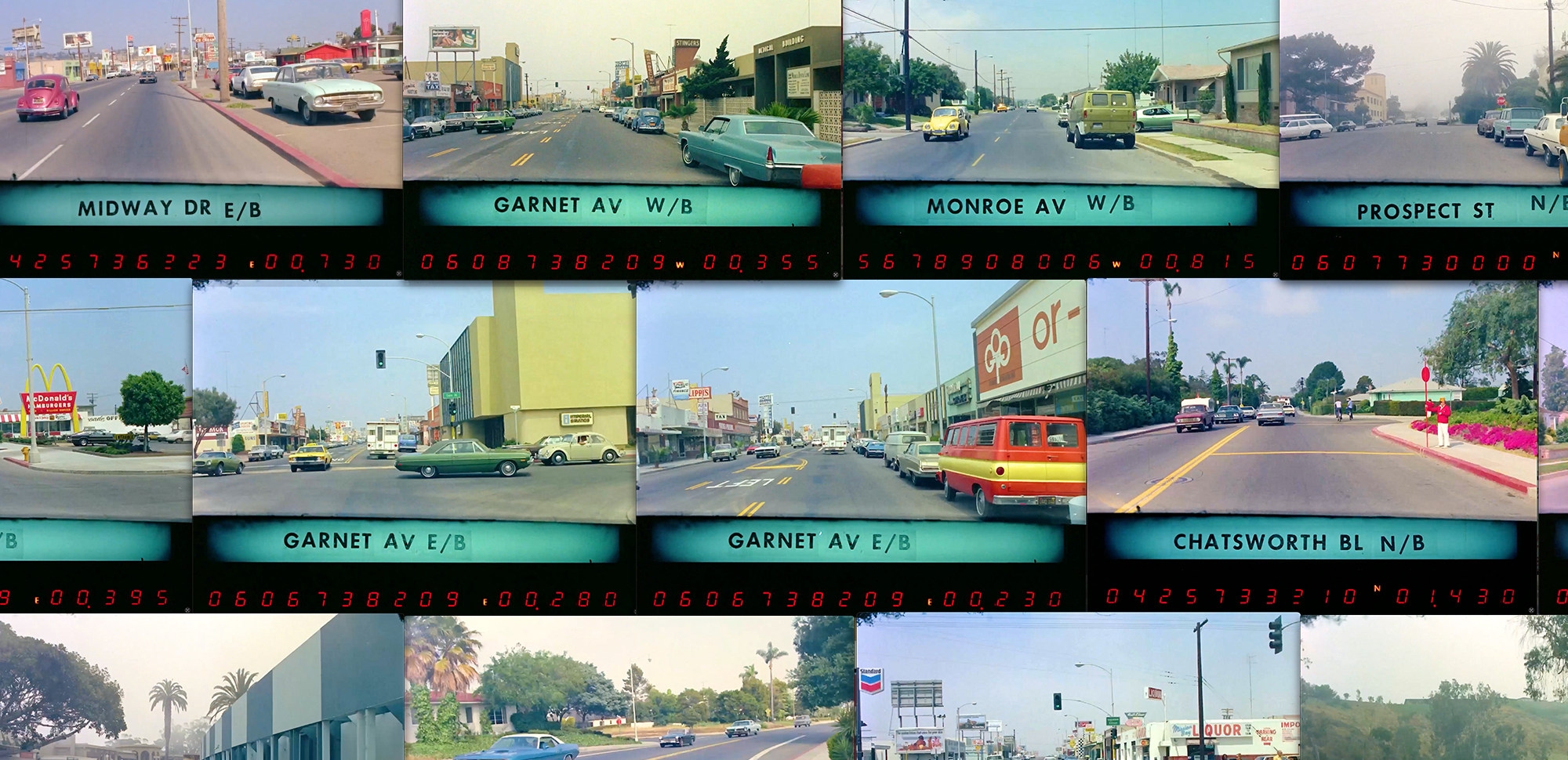
The very first post of this newsletter back in 2022 was about Connecticut’s highway photologs from the 1980s. Photologs were essentially an early, film-based version of Google Street View. Almost every state had one of these photolog programs with tricked-out vans logging every mile of road in their state, with some dating back to 1961. The Connecticut footage is a time capsule of the mid 80’s, but the frames are pretty low-res and grainy. While digging through the Internet Archive, I discovered the crispest, most beautiful photologs I've ever seen—captured in San Diego during the 1970s.
Collected by the San Diego Transportation and Storm Water Department, these sharp scans right from the 35mm film source let you peek through a window into the sunny streets of San Diego, full of pastel-colored cars, family restaurants like Bonanza, and some colorful people caught unaware.
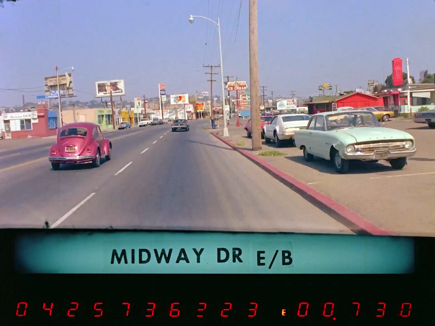
One frame from the San Diego 35mm photolog footage. The numbers at the bottom indicate the date, mileage, and direction.
After poring over every frame of the ten videos in this collection, here are my takeaways:
🥩 People ate a lot of steak at themed restaurants
👯♀️ There were tons of strip clubs featuring “Go-go girls”
🚗 The range of car colors was amazing, with tons of pastels, bright reds, and a wild variety of greens
🤠 Signs for businesses were WAY more creative, and well-designed with great typography. And many were spinning.
🦩 Our world has lost its sense of whimsy
The original videos hosted on the Internet Archive look to be unaltered, and not adjusted for brightness. I took the liberty of doing some color correction, and boosting the contrast on these films. After removing the grey veil from this footage, I want to jump into this world—a version of Grand Theft Auto set in the sprawling San Diego of 1973.
Having grown up on the East Coast in the '70s and '80s, I find a lot of the businesses and landscapes unfamiliar. But some of the businesses like Jack-in-the-Box, Fotomat, Bonanza, and the 76 gas station ball all take me back.
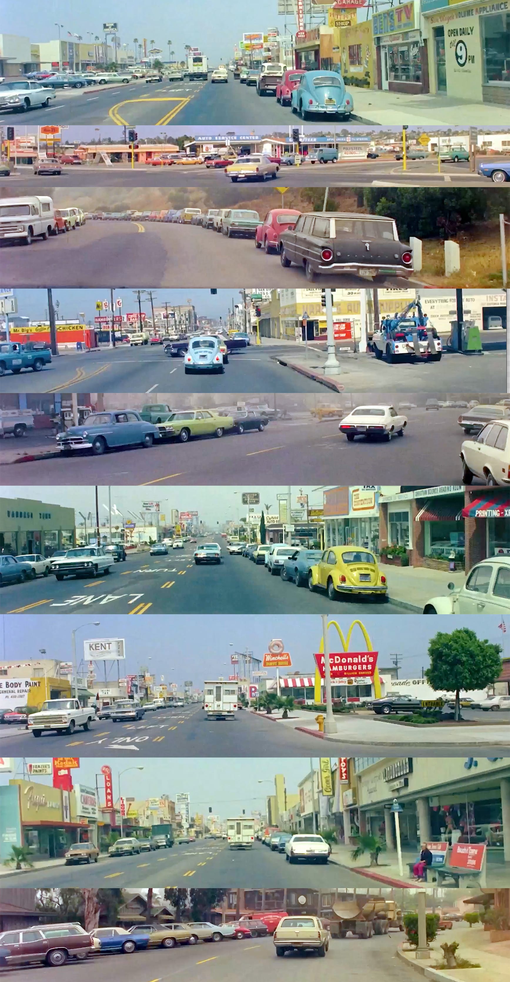
Nice bright colors
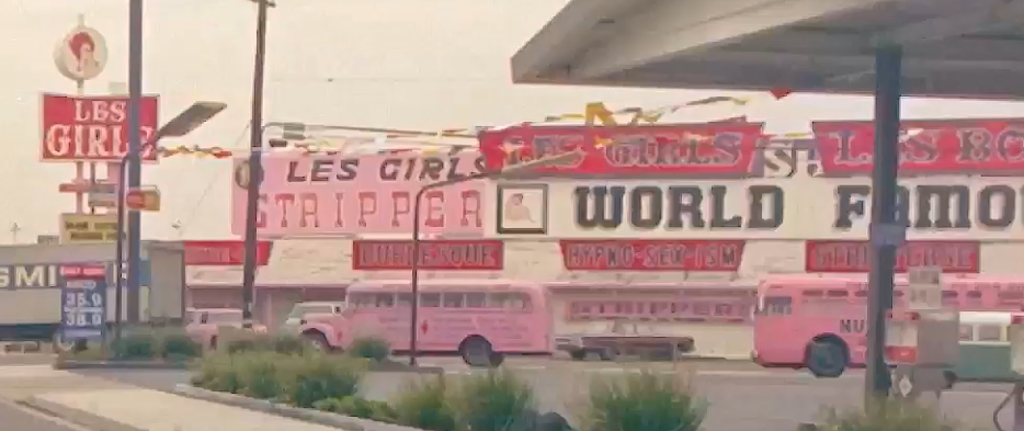
I’m really struck by just how colorful everything was. There are some moments captured on these frames that are just incredible compositions of color, geometry, and type.The footage has a distinctly Wes Anderson vibe—the Futura road labels and the warm, sun-washed palette. You can almost imagine Bill Murray or Jason Schwartzman emerging from a perfectly centered emerald-green Datsun parked beneath the blazing pink signs of "LES GIRLS," advertising "BURLESQUE" and "HYPNO-SEX-ISM."
The cars just look so simple. Heavy steel and glass, seat belts nobody used, and a rainbow of shiny colors. Today, cars seem to come in three colors: white, silver, and black. That’s pretty much it. It is truly sad to see how far the typical car has fallen from the colorful options that even basic cars had. Though projects like Slate auto’s DIY wraps do give me hope for a more colorful automotive future.
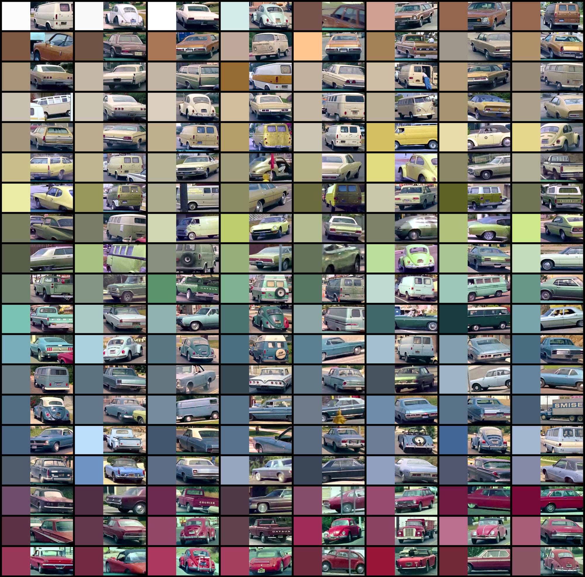
Just look at the variety of colors from some of the cars on the streets of San Diego back in the early 1970s.
Staring at these frames, I can almost imagine being there. Nobody is looking at a phone. You're rolling down Camino Del Rio smoking a Lark, listening to Rare Earth, before pulling into a Texaco to pay $0.34 per gallon for low-lead Fire Chief gas and fill up your "Mellow Yellow" AMC Gremlin. Later you will go see Charlton Heston in The Omega Man at the Frontier Drive-In.
Signs of the time
There is a dazzling array of signage in these frames. So many of the signs were motorized — actually spinning. Barber shops, fabric stores, dry cleaners, upholsterers, and tire shops all had beautifully made signs with inspired typography — to say nothing of their architecture. Comparing the rich variety of signs from these frames with today's bland storefronts makes me weep for an entire industry of sign-painters, neon shops, and fabricators that were probably killed by vinyl banners and LED-lit boxes.
After absorbing all these signs, I emailed Aaron Draplin, acclaimed graphic designer and owner of Draplin Design Co. Had he been born 20 years earlier, Draplin would be running a workshop making signs like these. His work celebrates the thick lines and bold design of this era, so I asked him — how did we lose all of this?
Draplin sent me back a voice memo recorded on a walk: "Why those [signs] look different — 50 years ago, 40 years ago? Somewhere around 35 years ago, they become pretty predictable." What Draplin pointed to was the computer, and the precision it brought.
"Up to that point, you had the quality of the human element, the human error. That was beautiful. If you had to paint a sign, the spacing was off. Certain things were a little wider than they should be, but there's just a certain charm."
Draplin said those imperfections just don't exist with today's tools — even though designers still chase that look. "So there's just this kind of perfect sprinkle of 'shitty' to that stuff...no amount of filters or texture tricks or whatever can sort of nail," said Draplin.
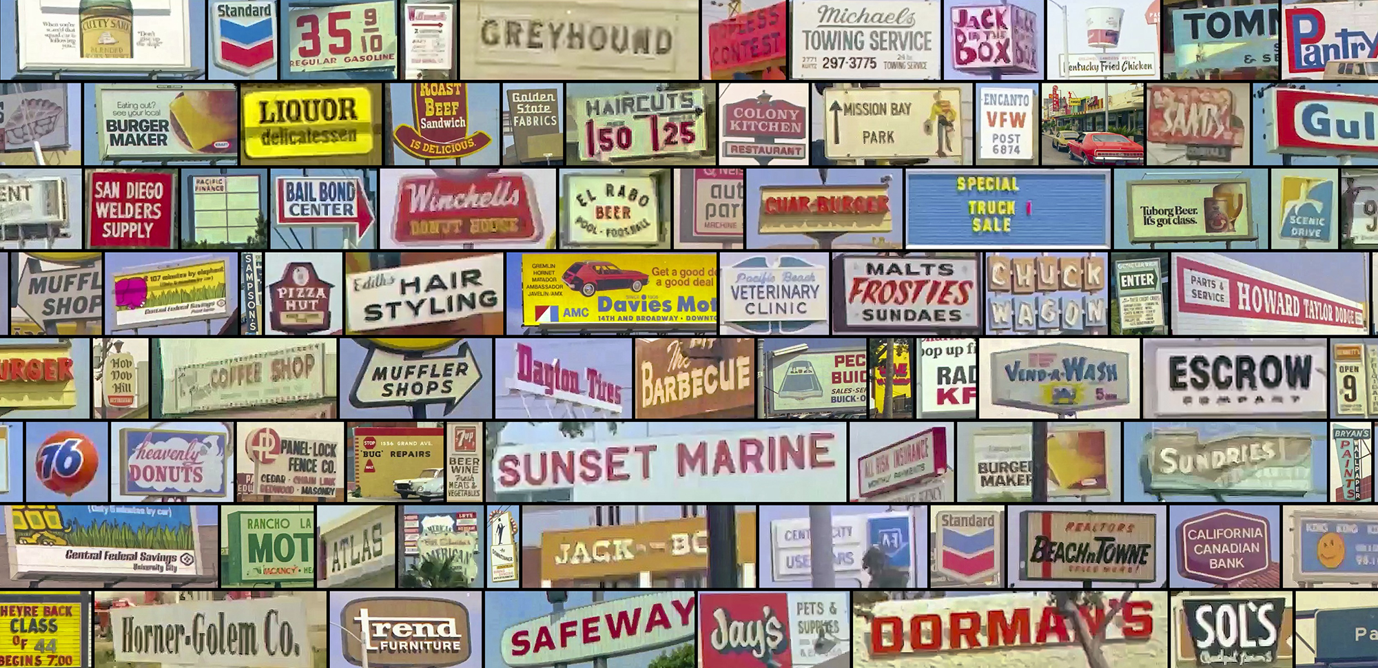
Some of the wonderful signs collected from the footage.
Spinning, off-kilter Kentucky Fried Chicken buckets, creepy Jack-in-the-Box puppets, Giant Arby's cowboy hats, and Chuck Wagon's ALL YOU CAN EAT – IT'S DELICIOUS cartoon cowboy sign are all wonderful commercial kitsch lost to time.
When I see all the people caught on these frames, going about their shopping, biking home from school, I wonder where they are today. These films appear to be from 1973. One woman crossing the road was holding her baby, who I realized is probably my age today.
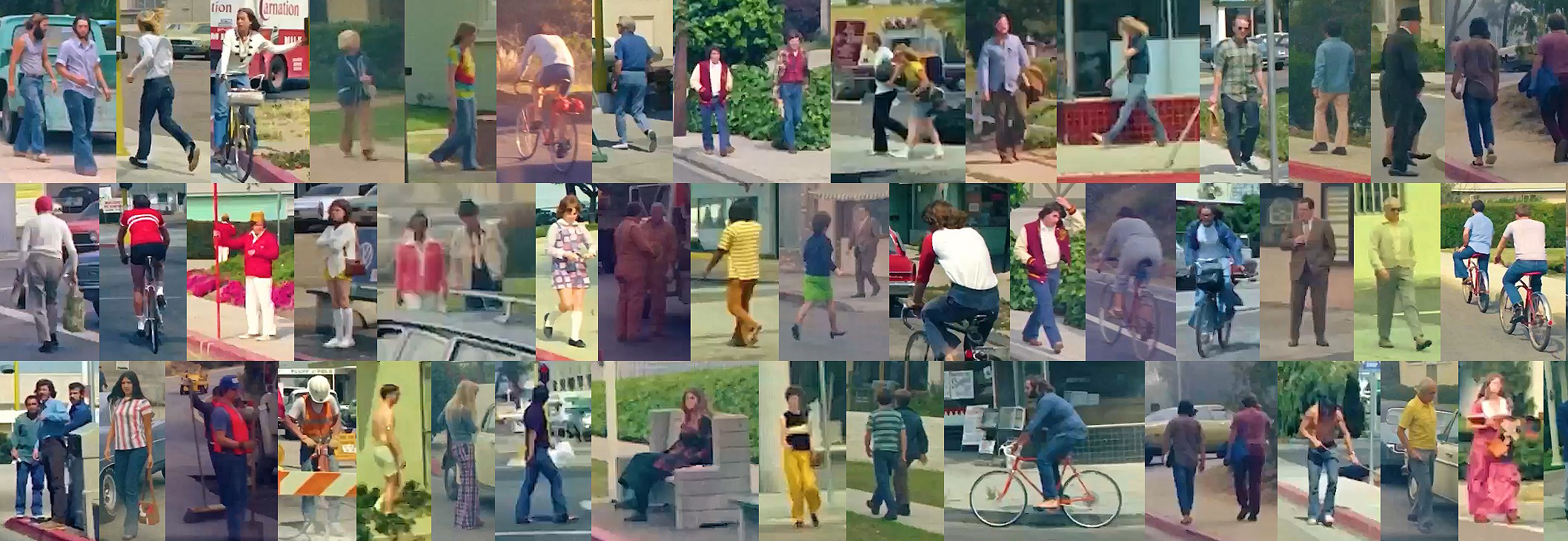
Some of the people walking along the streets in the footage. Where are they now?
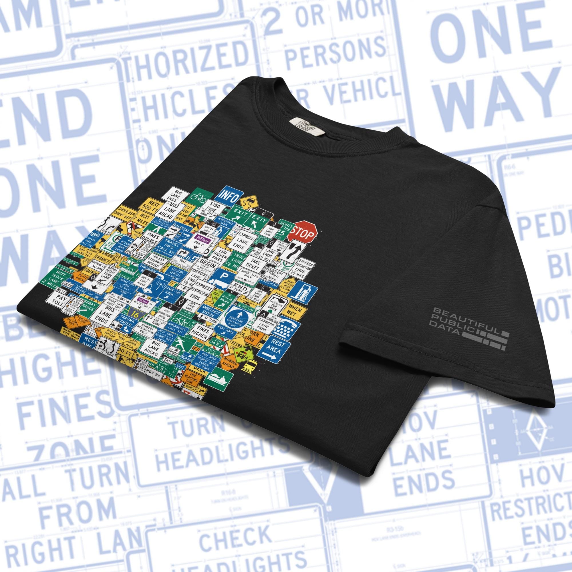
MUTCD Highway Signs T-Shirt
The Federal Highway Administration’s (FHWA) “Manual on Uniform Traffic Control Devices” (MUTCD), is a hefty tome consisting of close to 900 pages that contains the federal standards for all traffic safety signs, roadway markings and other “traffic control devices” that a driver on a road in the U.S. might encounter.
This shirt features an original design built from some of the signs you drive past every day on America's roads and highways.
Premium quality unisex garment-dyed heavyweight t-shirt made of 100% ring-spun cotton.
👨🏻💻
Nerdbox
For this post, I used Claude Code to write Python scripts help extract cars, people and signs, which used Meta's SAM2 segmentation model.
I used ImageMagick to make the image quilts.
🙏🏻
Did you enjoy this post? You can subscribe to our newsletter to get future posts delivered to your inbox for free. 👉🏻 📫 Subscribe now.
☕️ Buy me a coffee Say thanks with a one time tip.
Sharing is caring 📣 If you think your followers or friends may like it, please consider sharing it.
👕🖼️ ****Buy Beautiful Public Data merch on our shop. **** Unique t-shirts and prints inspired by our stories
🙋🏻♀️ If you have any suggestions, comments or requests, please email them to beautifulpublicdata@gmail.com
Thanks for reading!
- Jon Keegan Bluesky: @jonkeegan.com
这条对你有帮助吗?