The AI Aesthetic
摘要
文章以 “AI 美学” 为题,观察当前 AI 产品界面中涌现的视觉与交互模式,如闪烁文本表示 “思考”、小图标、米色 / 奶油色背景、橙色点缀、衬线字体以及非确定性的界面重绘等。作者对比了 Claude、Codex、Cursor 等桌面 AI 应用与 macOS 原生应用的图标差异,并回顾了汉堡菜单、✨符号等历史设计潮流的演变,思考哪些 AI 时代的美学特征会沉淀为长期交互范式。文章属于设计文化观察,没有提供具体工具或方法。
荐读理由
文章提供了对AI产品界面设计趋势的观察,如闪烁文本、小图标等,可帮助你在设计自己的AI产品时避免盲目跟风,并理解这些模式可能成为长期范式。但内容偏文化评论,缺乏可迁移的具体方法,证据间接。
原文
The AI Aesthetic
- 2026-07-29
Every zeitgeist comes with new design idioms unique to its challenges. Many of them disappear as fads change, but others bake themselves into deeper parts of existing software interaction paradigms.
For example, there’s the hamburger menu (≡) which saw a proliferation during the rise of mobile due to the constraints around screen size. It has since spread to many other parts of software interaction design and will likely remain prevalent for a long time as a terse way of indicating “more menu-type content here”.
As another example, before AI what were the connotations of the sparkle emoji ✨? Personally, I don’t know, but now it means AI. (AI = sparkles and rainbow colors — it’s funny when you think about it. They should’ve just thrown unicorns in there for the trifecta. AI = sparkles, rainbows, and unicorns ✨🌈🦄. Apt.)
Some patterns are very specific to the interactions inherent to the nature of AI as a technology. For example: streaming text. This is a pattern made for and refined by chat interfaces, so it may not have tons of utility for reuse across other software interaction paradigms.

Then there are other patterns that’ve been refined by AI interfaces and are starting to spread to other places in software. For example, the “shimmering text” which in AI land implies a kind of “thinking” but is being repurposed to indicate any kind of asynchronous task (thinking, fetching, computing, etc.).

Then there are other influences my subconscious is picking up on. For example, a lot of AI apps use tiny icons. These are most obvious (to me) in desktop Electron apps because they clash with the system-level grain of applications. Take a look at this screenshot, where you have desktop AI apps on the left (Claude, Codex, Cursor) and macOS apps from Apple on the right (Finder, Photos, Mail). You can see how the AI apps all have much smaller, thinner icons than their native counterparts.
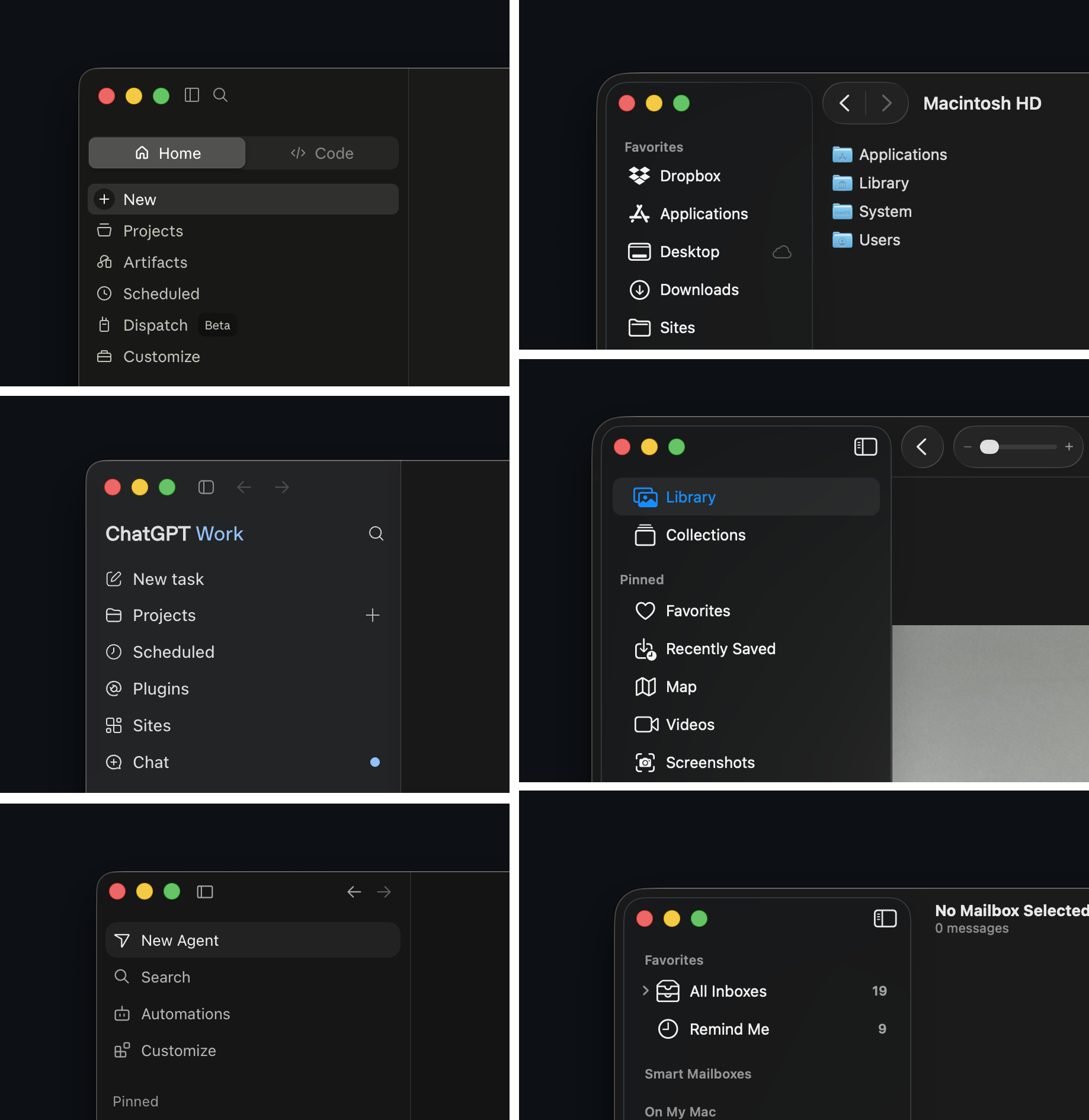
Are tiny icons our collective future in interfacing with computers? (Personally, I hope not.)
There are other aesthetics my brain associates with AI, like beige/cream colors, orange accents, and serif typefaces as well as whack-a-mole UI controls (you know, the ones where you click the toggle and the entire UI repaints and you have to move your mouse somewhere else in the UI to click the toggle again? The non-determinism of AI’s grain has seeped into its UI/X).
It all makes me wonder what other aesthetics are being born out of this AI moment and how many will spread, take seed, and become part of common software interaction paradigms for years or decades to come?
这条对你有帮助吗?