The mean means nothing
摘要
作者在验证构建性能优化时发现均值指标无法反映真实变化,通过一个合成数据集展示了同一组数据在不同统计量和可视化下的矛盾结果:均值上升、中位数下降、p99 大幅恶化。文章介绍了 CDF(累积分布函数)、shift function、ridgeline 图、热力图和 jointplot 等可视化方法,指出双峰分布是均值误导的根源,并最终通过按缓存命中 / 未命中和响应大小拆分数据定位到根因(大对象缓存未命中)。核心观点是不要用单一统计量总结数据,应观察分布形状。
荐读理由
文章提供了可直接迁移到性能分析和A/B测试中的可视化方法(CDF、shift function、ridgeline等),并给出了具体判断规则(两条CDF交叉即无单一百分位可概括),能帮助读者避免被均值误导、定位双峰分布根因,提升数据洞察效率。
原文
I was recently trying to validate some performance improvements related to lld at $DAYJOB and it was a little frustrating to see the improvements in our benchmarks but not in the live-production dashboards.
Having come from a background working on web-services, I was used to looking at individual time-series dashboards, sometimes over a few percentiles, and I was expecing to see some noticeable change but the data seemed too noisy to make any conclusions.
Turns out a colleague had also faced similar issues when trying to evaluate build-speed improvements. There are lots of variables that can affect the build: cold-cache, incremental, local, remote, etc. and the build times can vary wildly depending on the state of the system and the workload. She ended up leveraging a cummulative distribution function (CDF) to visualize the data and it was a revelation to me.
This led me to explore a few other different ways to visualize data, in addition to the CDF, and how a single image or statistic is often not enough to tell the whole story. This post will walk through a single synthetic dataset and show how different visualizations can tell different stories about the same data. The goal is to convince you to look at your data and not just summarize it with a single number.
Everything below comes from one synthetic dataset with a fixed seed. The full script can be found in this gist. It is a single file with a nix-shell shebang, so you can reproduce every figure exactly as long as you are using nix.
Note I leveraged AI to help generate the data and charts in this post for the story. If that bugs you, sorry. 🤷
§The rollout that “made it worse”
Here is the setup: we operate a typical web-service and we rolled out a new caching tier over a week, hoping to cut request latency.
The change is fully deployed, and the latency dashboard that plots the mean looks like this:
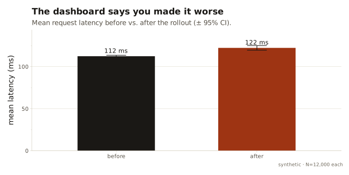
Mean latency went up, from 112 ms to 122 ms. ☹️
A SEV is cut, we revert the change and write the postmortem. Right? 🤔
§One number, four stories
It’s often good practice especially for web-services to look at various percentiles, especially the tail end of the distribution like the p95 and p99.
| statistic | before | after | change |
|---|---|---|---|
| mean | 112 ms | 122 ms | +9% |
| p50 (median) | 99 ms | 54 ms | −46% |
| p95 | 224 ms | 454 ms | +103% |
| p99 | 309 ms | 678 ms | +119% |
Now we have a problem, and the problem is that everyone is right. The mean says the change is a mild regression. The median (p50), says the change is a big-win, the typical request got nearly twice as fast. The p99 says it’s a SEV11SEV, or “Severity”, is a popularized way to describe an incident or outage. A SEV is often numerically ranked in descending order by impact, e.g., SEV0 being the most severe. , the worst requests more than doubling.
The mean and the median, computed from the very same numbers, point in opposite directions.
Engineers are often taught to be data-oriented, but often it’s easy to cherry-pick the statistic that supports your argument.
§Look at the shape
The next basic thing you can do with a distribution is plot its shape. Here are the two latency distributions, before and after, as densities:
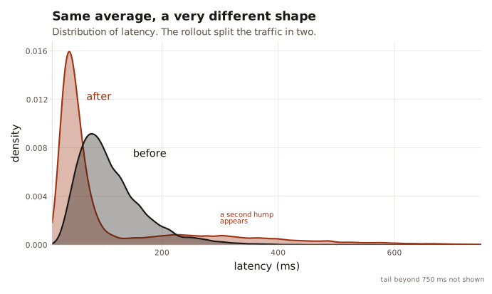
There it is. 🤓☝️ The “before” is one tidy hump. The “after” is two humps.
This already explains the earlier contradiction but it’s a bit tricky to visualize correctly. The shape depends on a smoothing parameter we chose, the two fills muddy each other where they overlap, and it’s genuinely hard to read a percentile off it. I can see there are two populations; I can’t easily see where the median went.
§The best chart you’re not using
The cumulative distribution function (CDF) answers one question for every percentile at once: what fraction of requests came in at or below x milliseconds?
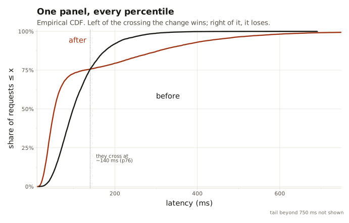
CDFs are an extremely easy way to visualize multiple percentiles in a single chart. Depending on the curve, we can understand how the request latency is distributed across the entire population.
I found it incredibly useful to then plot the “before” and “after” CDFs on the same chart to see how they compare. You can then visualize the shifts at various percentiles and understand how the change affected the entire population.
In our story, the “after” curve has shifted left for request latencies below 140ms. That means more requests are finishing faster than before. The “after” curve is higher than the “before” curve to the right of 140ms which means more requests are finishing slower than before. The two curves cross at ~140ms which is the tipping point where the change goes from being a win to a loss.
Tip Two CDFs that cross are the unmistakable signature of a change that no single percentile can summarize, because the sign of the effect depends on which percentile you ask.
§Who won, and by how much
The CDF tells us that the effect changes sign: faster or slower. The obvious next question is by how much, at each point in the distribution. We can plot for every percentile p, the after-latency minus the before-latency, known as the shift function.
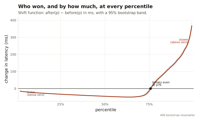
Below the zero line the change is faster; above it, slower. We can visualize the magnitude of the change at each percentile.
§The regression was there all along
So far we have looked at two frozen snapshots, before and after. Rollouts though are often not instant. In this story, we rolled out the new caching tier over a week, ramping from 0% to 100% of traffic.
What did each day look like? Stack one distribution per day and you get a ridgeline:
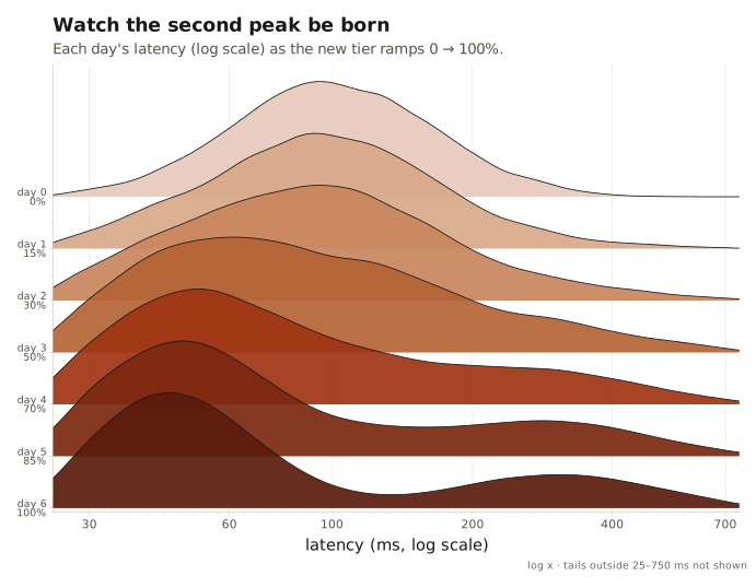
We can now visualize the regression emerging over time. We can see the main peak (the fast requests) sliding left as the rollout progresses, and a second peak (the slow requests) emerging on the right. The median is dropping, but the slow requests are quietly growing in number and latency.
The x-axis here is logarithmic. Latency is roughly lognormal, and on a linear axis the fast peak is a tall spike next to an invisible smear; the log axis is what lets both humps read as humps.
We can do something similar, squeezed into a single grid, as a heatmap. One column per day, colour for how much traffic lands at each latency:
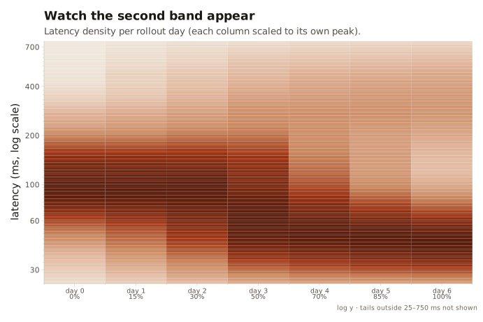
You can sort-of make out a new population emerging faintly.
Any aggregate computed over the whole week would have blended these seven very different days into one muddy number and hidden the trend completely.
§The bimodality had a cause
We’ve now thoroughly established what happened. The next question is why. This is in fact very similar to $DAYJOB where I had to cut the data by binary sizes (i.e. >50MiB) to observe the bimodality in the latency distribution.
In our story, new tier either serves a request from cache (a hit) or falls through to the backend with an extra hop (a miss). We can split the “after” requests by that property and draw a CDF for each:
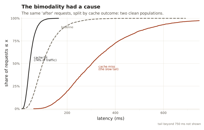
Conditioned on cache outcome, each population is unimodal again.
We can easily see that cache hits are faster than the old baseline as they are shifted left.
Cache misses pay for the extra hop and land far to the right.
§Why those requests?
“Some requests miss the cache” is a mechanism, but it isn’t yet a cause. Which requests miss, and why?
Each request carries one more field I haven’t used yet: its response size.
A cache holds small, hot objects; big ones get evicted or never fit. We can plot the latency against the response size, and colour each point by whether it was a cache hit or miss. We can also add a density to each margin to see how the two populations are distributed along each axis: a jointplot:
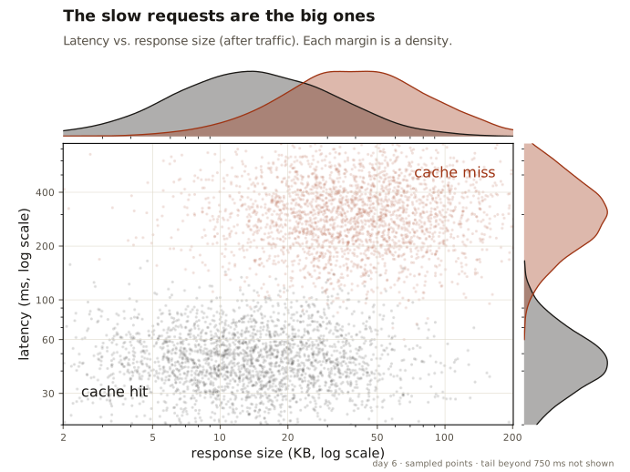
We can see two clean population clusters: small-and-fast (cache hits) and large-and-slow (cache misses). It’s clear that the bimodality in the latency distribution is caused by the bimodality in the response size distribution.
We now have something actionable: raise the cache’s max object size, or split the big responses. 🔥
§A graph is worth a thousand numbers
Often a single panel or graph is too small to tell the whole story at best. At worst, it can be misleading. It is beneficial to have multiple views of the same data to understand the full story.
I was especially impressed with the way the CDF can convey the entire distribution in a single chart especially when comparing what might appear to be multiple populations.
“Do not trust any statistics you did not fake yourself.” – Winston Churchill
这条对你有帮助吗?