Every Frame Perfect
摘要
作者受 Wayland 技术目标的启发,提出 UI 每一帧的截图都应具备合理性。文章列举了提升 UI 质量的实践准则,包括消除屏幕闪烁、防止加载时的布局偏移、保持状态一致性以及确保动画精确。通过分析 Safari、YouTube 及系统应用中常见的动画不同步和逻辑断层案例,作者呼吁开发者不仅要关注 UI 的起始状态,更要重视转场过程中的细节表现。
荐读理由
本文将 UI 细节作为用户判断代码质量的启发式指标,为追求产品质感的开发者提供了“每一帧都完美”的具体检查准则,包括规避内容加载时的布局跳动、动画不同步等损害信任的细节坑。
原文
Every Frame Perfect
A while ago I was reading about Wayland and this quote stuck with me:
A stated goal of Wayland is “every frame is perfect”.
And I think this is a goal we should all aspire to. Wayland is talking about the technical side of things (modern GPU stacks are very complex and Wayland is trying to take control back) but it could be applied to UI too.
The rule of thumb is:
If I take a screenshot of your app at any moment, it must make sense
Why care about every frame? It builds trust. Users can’t see the code, so UI is the only way for them to judge the quality of the app. If UI looks good, that means developers had time to polish it, which means that they probably spent a comparable amount of time to iron out the code. It’s a heuristic, but a reasonable one.
Now, what does it mean in practice? I can think of a few things:
No white flashes between screens.
No partially loaded content.
No relayout while content loads.
Internally consistent. If one part of the UI says “1 update available”, another part should not say “Checking for updates...”
Precise animations.
Animations often end up being forgotten. A UI might look great in both start and end states but very janky in between. Like this:
If you feel like there are weird things going on there, there are! Look at slowed down version:
Now let’s apply our rule and take screenshots in the middle of the animation. This doesn’t look right:
Neither does this:
Both of these frames are not perfect.
Let’s look at another example. Safari:
Placeholder text here moves from the center but cursor animates from the left position:
Not the end of the world by any means, but it does create a feeling that these two components are not in sync with each other. Next thought: maybe they weren’t designed together? If so, then they might not work well together. That’s how trust is lost.
This desynchronization can lead to a lot of confusion. For example, in Photos, when switching between Crop and Adjust mode, picture snaps into place immediately but the crop border is animated:
This creates a false feeling that something subtly changes when you switch between modes. And you know what? I don’t want my UI to give me false feelings. I want it to be a precise instrument, not an animated toy.
Sometimes animations are supposed to help you understand a transition, so it’s doubly sad when they make it harder. Follow the magnifying glass:
Same with Youtube. They had the simplest task in the world: move a rectangle from one position to another! Yet they decided to do something very strange:
Can you explain this? Does it make sense?
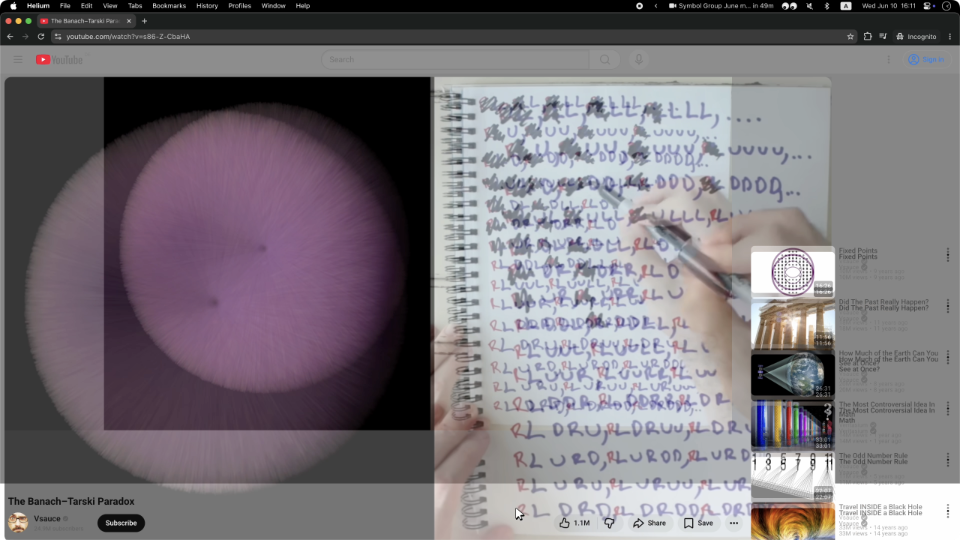
Probably a technical limitation of the DOM architecture they decided earlier on. I call these situations “The technology has outsmarted the programmer”. But no matter the reason, the result is an imperfect frame.
Sometimes animations are left out as an afterthought. Whatever happens, happens. Then we get this:
The details are fascinating to watch:
So yeah. Please pay attention not only to the start and end states, but also to everything in between. Every frame matters.
I’ll leave you with this unprovoked zoom animation from Preview app. Take care!
June 13, 2026
这条对你有帮助吗?